The Science of Colors
Have you ever noticed how a bright blue sky lifts your mood or how the color red makes your heart beat faster? It's not just about you! Colors aren't just shades that make things look pretty, they have a serious psychological impact.
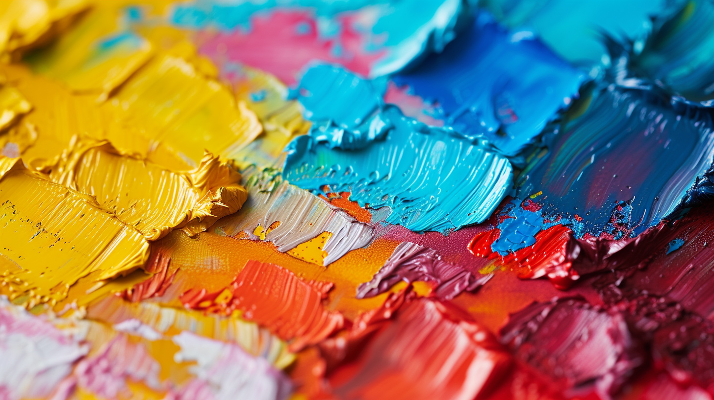
Imagine this: you're walking down the street, and everything around you is in gray tones - just like in an old movie. Sounds pretty boring, right? Colors breathe life into our world, influencing our moods, choices and even behavior without us even realizing it. This is the magic of color psychology, the secret sauce that makes you feel calm in a green park or energized by a vibrant piece of art.
Let's kick things off with what color psychology actually is. Imagine a silent language where colors are the words. This isn't a new concept. In fact, it's been around for centuries. Ancient Egyptians and Greeks used colors for their healing powers, kind of like an early version of mood lighting. Fast forward to today, and we've got a whole science dedicated to understanding how color influences our noggin.
Now, how do we even see colors? It all starts with a bit of eye magic. Light hits an object, bounces off, and zooms straight into our eyes. Inside our eyes are these tiny warriors called rods and cones. Rods are night vision experts, while cones are all about color. They grab the light and chat with our brain, translating it into the colors we see. It's like a live concert in your eyes, with light as the music and your brain as the audience, jamming to the color tunes!
But here's where it gets juicy. Colors aren't just pretty; they pack an emotional punch. Each color whispers different feelings and moods into our minds. Take the primary colors, for instance. Red isn't just a color; it's a heart race, often yelling 'Hey, look here!' or pumping some extra energy. Blue, on the other hand, is the chill dude. It's like a deep breath, often washing over us with calm and trust. And yellow? It's the life of the party, spreading joy and sparking creativity.
Don't forget the secondary colors, those cool mixes of the primaries. Each blend stirs up its own unique vibe and feeling. It's like a color cocktail, with each sip—or in this case, glance—offering a new experience.
Have you ever wondered why you feel calm under a cool blue sky or why a bright red car catches your attention? Turns out there's a whole science to how colors affect your brain.
Picture this: You're in a room painted a soft lavender. How do you feel? Relaxed, right? Now, imagine being in a room with bright yellow walls. Feels energizing, doesn't it? That's color psychology in action! Researchers have found that colors don't just make things look pretty; they can also stir up a whole cocktail of emotions.
For instance, a study showed that people associate blue and green with calmness and efficiency. Red, however, is like the adrenaline junkie of colors – it's all about excitement and passion. And it's not just about feeling good or pumped. Colors like gray or brown might make you feel, well, a bit down. They're like the cloudy, rainy days of the color world.
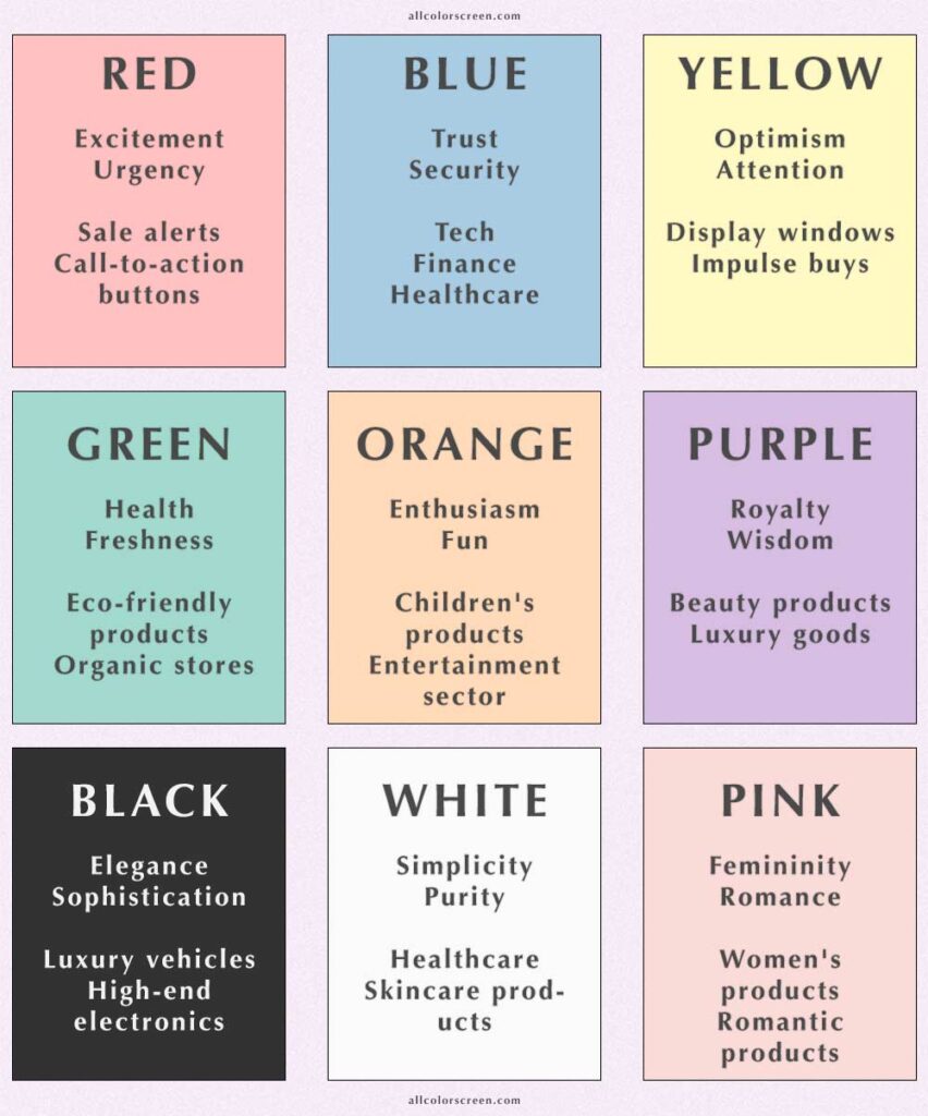
Below is a table of symbolic color meanings often recognized in various cultural contexts. Remember, these associations can vary significantly based on culture, context, and individual experience.
| Color | Symbolic Meaning(s) | Emoji | Link to color screen |
|---|---|---|---|
| Red | Passion, Love, Danger, Courage, Energy | ❤️/😡 | Red Screen |
| Orange | Creativity, Adventure, Enthusiasm, Success | 🧡/😊 | Orange Screen |
| Yellow | Joy, Intellect, Energy, Freshness | 😃 | Yellow Screen |
| Green | Nature, Growth, Harmony, Freshness, Safety | 😌/🌱 | Green Screen |
| Blue | Stability, Trust, Serenity, Peace, Sadness | 😇/😔 | Blue Screen |
| Purple | Royalty, Luxury, Wisdom, Dignity, Spirituality | 🤴/🔮 | Purple Screen |
| Pink | Romance, Femininity, Playfulness, Kindness | 💕/😄 | Pink Screen |
| White | Purity, Innocence, Cleanliness, Peace | 🕊️/🤍 | White Screen |
| Black | Mystery, Elegance, Power, Sophistication, Grief | 🖤/😢 | Black Screen |
| Grey | Neutrality, Balance, Sophistication | 😐/😶 | Grey Screen |
| Brown | Stability, Wholesomeness, Dependability | 🛖/🤎 | Brown Screen |
This table summarizes the general meanings of colors, but it is important to note that interpretations may differ depending on cultural nuances and personal experience
Colors have this ninja-like ability to mess with how we perceive things. For example, sports teams wearing black uniforms are often seen as more aggressive. And get this - the color of a pill can even convince your brain it's more effective! A bright, peppy color for a painkiller? Your brain might just trick you into thinking it works faster. It's like colors have their own secret language!
Everyone has a favorite color, but ever wondered why you're drawn to it? Researchers think that our color preferences might say a lot about our personalities. Love blue? You might be the cool, collected type. Obsessed with red? Maybe you're a bit of a live wire!
But it's not just about what your favorite color says about you. It's also about what colors you're not so fond of. Some studies suggest that our color aversions are linked to our past experiences. So, if you can't stand the sight of a certain color, it might be tied to a not-so-great memory.
First off, let's talk about what these brainy folks are digging into. Turns out, our brains and colors are like old pals. They interact in ways that can sway our moods, decisions, and even our well-being. One expert pointed out that the color red can kickstart our energy levels – ever noticed that many 'Sale' signs are red? That's no accident!
But it's not just about splashing colors around. These experts stress the importance of context. Take green, for instance. In a forest, it's calming. But in food, it might signal spoilage and turn you off. Context is king in the world of color psychology.
Let's paint a picture of how this plays out in real life. In marketing, colors are the silent salespeople. Brands use specific colors to nudge you into feeling a certain way about their products. Ever seen a luxury brand rocking a deep, royal blue? That's not just pretty – it's psychology at work, signaling trust and dependability.
And it's not just ads and logos. Interior designers are in on this too. They use colors to shape the vibe of a space. A splash of yellow might bring cheer to a dreary office, while a calming blue could be just the ticket for a stress-free bedroom.
Schools are also getting colorful. Some are using color-coded environments to boost learning and creativity. Imagine diving into a history lesson in a warm, earth-toned room – it's like time-traveling to Ancient Rome!
Ever noticed how certain brands just seem to stick in your mind? Or how some offices feel more ‘alive’ than others? Well, it's not just by chance. It's color psychology in action, subtly weaving through our everyday experiences.
Think about McDonald's. Those golden arches against a red background aren't just a random choice. Red and yellow, a combo that screams attention and happiness, make you notice and crave that Big Mac. It's no secret, brands like Coca-Cola, Facebook, and Tiffany & Co. have nailed their color game. Red for excitement, blue for trust, and that Tiffany blue? Well, it's not just any blue, it's a shade synonymous with luxury and exclusivity. It's all about color psychology, tapping into our emotions, and, let's be honest, our wallets too.
Imagine walking into an office with grey walls, grey carpets, and fluorescent lights. Feels like a scene from a gloomy movie, right? Now, picture this – vibrant art, green plants, and soft, warm lighting. Suddenly, you're not just clocking in; you're stepping into a space that fuels creativity and calmness. Companies are catching on, using colors to boost productivity and well-being. Google's offices are like a playground of colors, each hue purposefully chosen to spark innovation and collaboration. It's not just about looking pretty; it's about creating environments where ideas flow and stress levels drop.
Colors have a secret power – they can heal. Chromotherapy, or color therapy, isn't just a trend; it's a practice rooted in history. Picture a room bathed in soothing blue light, or the calmness that washes over you in a soft, pink space. Therapists and health experts are using colors to soothe, energize, and uplift. From calming blues and greens in hospitals to vibrant reds and oranges in fitness centers, colors are working their magic, not just on the walls, but on our minds and bodies.
Let's paint a picture of the future with some bold strokes and bright shades.
First up, let's talk tech. In the digital world, colors are more than just decoration; they're a language. App developers and web designers are already using color to guide us, calm us, or get us excited. But imagine a future where your smart devices adjust their color scheme based on your mood, the weather, or the time of day. Feeling a bit blue? Your smart home could sense it and soften the room's lighting to a comforting, warm glow. How's that for mood lighting?
Next, let's dive into the world of healthcare. Hospitals and clinics have started embracing soothing colors to make their spaces less intimidating. But the future holds more than just a fresh coat of paint. We're talking about dynamic color environments, tailored to enhance patient recovery. Picture a recovery room that changes color to promote relaxation, stimulate appetite, or even reduce the perception of pain. That's not just smart design; it's smart care!
But it's not just about where we live or heal; it's also about how we work and play. Companies are already keen on using colors to boost productivity and creativity in the workplace. In the future, we might see workspaces designed with color zones, each tuned to different tasks and moods. Need to brainstorm? Step into a vibrant, yellow-themed room that sparks creativity. Time to focus? A blue-toned space might just be your concentration haven.
And let's not forget the artists, the dreamers, and the creators. The future of color psychology is a canvas for them, too. We're talking about new forms of art and entertainment that don't just use color but respond to it. Interactive art installations that change with the viewer's emotions, or live performances where the stage's color sets the mood in real-time. It's not just art; it's an experience!
So, as we look ahead, one thing's clear: the future of color psychology is as bright and as varied as a painter's palette. It's a future where technology, healthcare, work, and art all get a touch of color magic. And in this vivid world, understanding color psychology won't just be about knowing facts; it'll be about living them.